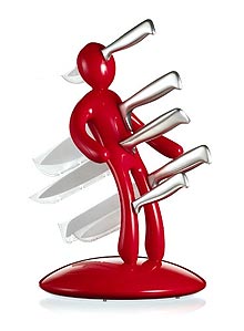
As I was cleaning my kitchen today, I had to move my knife block around, dust him off, and think about him as I rarely do when I’m just snagging a knife. He’s shiny and red, and yes, he has a name — Stanley, which is, for the record, not a name of anyone I know.

Stanley’s a little too tall for my kitchen, but I love him too much to replace him.

The thing is, I realized that part of why I love him is that I have a private myth around Stanley, that I built at some point in the past. I think that, in the absence of useful group myths, and even in their presence, sometimes we make up stories around our things and our surroundings and our lives, myths that are only for us. Or at least I do — maybe I’m the only one, but I doubt it.

I tell myself that Stanley actually likes his knives, and that he only hurts when when one is missing, like the ache where your wisdom teeth used to be, dull and hollow. Of course, the down side is that if they’re ever all missing for too long, he’ll come looking for them — and for me, to remind me never to do that again. Except for the bread knife, which is often out on the bread board with the bread, I do mostly keep him full up.

Especially that big one right in his heart — I wouldn’t want Stanley to have a heartache, after all.


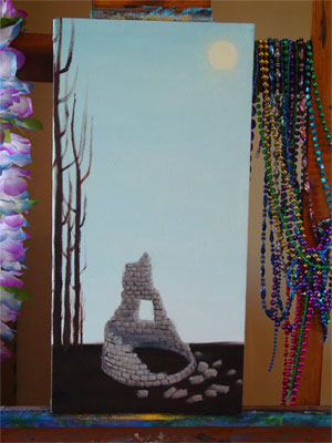
Walls thumbnailTitle: Till the Walls Shall Crumble to Ruin
Media:
Oil on canvas, digital photos thereof, InDesign layout & color laser prints on parchment paper
Commissioner: Natalie
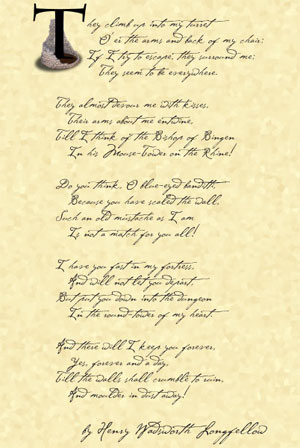
Sources: “The Children’s Hour” by Longfellow, and the Cezanne font
Notes: I am a terrible art photographer, so please excuse the uneven colours and strange shadows and glare. This project took ages (finding a box to ship it in was an unexpected challenge!) but I feel like the time spent was worth it, given the end result.

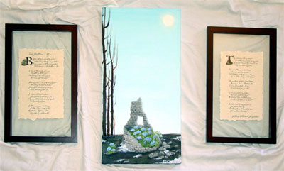
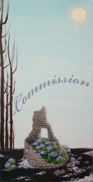
I wasn’t sure how it would all work out when Natalie came to me wanting a painting. We talked for a long while on gmail, bandying ideas back and forth, drawing out the images she was really interested in, and over the course of days the idea of the triptych was born. The canvas itself is smallish, 10x20in, and I really enjoyed working in the odd dimensions with what felt like infinite sky stretching up above the tower slowly crumbling away on the cold winter ground.

There was a story to Natalie’s choices, but it’s not really mine to tell. Suffice it to say she is happy with the results, and hopes to have it hung in her new home soon.

Since my own walls are yellow, rather than white, I took a photo on a sheet to give one an idea of how it looks all assembled.

Till the Walls Shall Crumble to Ruin

Here’s a better shot of just the painting itself, cold winter sky and stretched above and the snow melting into the dark, frozen earth, and the hydrangeas bravely blooming on anyway.

Till the Walls Shall Crumble to Ruin

You can see that I found “float” frames in a dimension that’s similar to the canvas, tall and thin, and we split up the poem’s stanzas into two groups. On page 1 we have a photograph of the little stray hydrangea bush that was blooming valiantly outside the tower’s shelter, huddled up to our leading B. On page 2 I used a photo of the tower from the middle of the painting process, before the bushes were painted in, to allow the T to grow up out of it unencumbered.

The Children's Hour 1

The Children's Hour 2

And now, a bit of the process! I’m doing it backwards this time so that those who just want to see the final don’t have to scroll. 😉

The very first step was to create that cold winter sky and the hard, dark ground below. I actually was really tempted just to keep the canvas once it was done, there was something really appealing for me about the juxtaposition of colour and shade here, but I was good and kept going.

Step 1

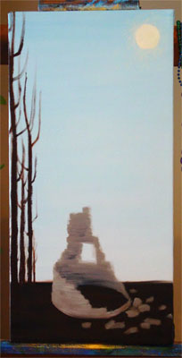
Then, once the background was nice and dry, I put in the sun and the trees, and blocked in the shape and shade of the tower.

Step 2

Next the tower got shade and details put in, the shape of the bricks coming out. This is the stage that I photographed for the illuminated letter T.

Step 3

Leaves! There were bushy plants painted in, just waiting for their blossoms.

Step 4

I’ve skipped a few stages in here, but the blossoms went in and, some snow was added to the ground as well as shadows and some extra dimensionality for the scattered bricks on the ground. At this point I hung it in the living room to dry so I could look at it in low light, and the only real difference from this to the final is some extra highlighting and shading, and another layer of soft glow around the sun.

Step 5

And of course, there’s the finished product, which you can scroll up to see again!


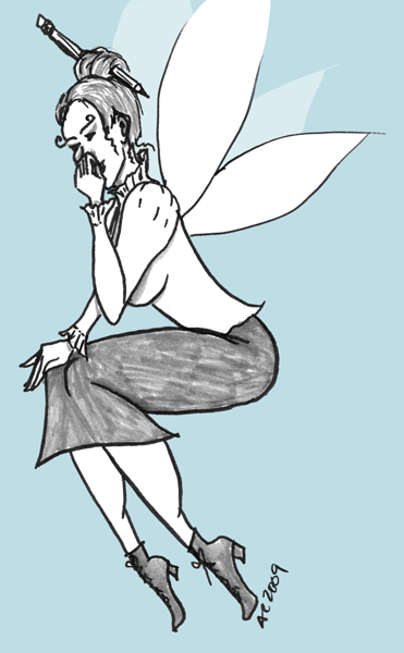
The incomparable Havi Brooks wrote on her blog about her inner Writer Havi (she said “Writer Me” but you can see how that would be confusing), a Tinkerbell-sized fairy with a prim pencil skirt and her hair held up in a bun. She was also laughing hysterically, and the image of her, proper and delicate and spinning around while she giggled helplessly stuck with me. In fact, it brought up the idea of my own inner Artist Me, the svelte, together artist who actually paints more than once every week or so.

Inspired, I managed to eke some time out of a busy week to draw!

First, we have Writer Havi.

She’s in black & white (on a “fluent blue” background) because all photos I see of Havi are b&w.; Selma gets full color, but Havi’s always tastefully done in shades of grey.

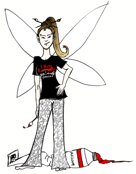
Next, we have Artist Amy.

She got a little color, and a t-shirt I’ve decided I need to find or make on Cafepress. She also has a non-black version of my Jolly Roger pajama pants on, and something resembling my current hair color, so go her!


Let’s hope that Havi & I can both bring these fairies out to shine more often!


One of the questions that I’ve been asked recently is what it’s like working with me — not just the personality things, but the actual process from start to finish, so I thought I’d see if I could outline the stages a little bit.

Step 1: Finding Me

Most of my clients find me through referrals. I don’t actually have a big client list — maybe 4-6 active clients at any one time — but I’ve kept a few of the same clients for most of the time I’ve been freelancing, which helps a lot. I’ve also been doing some in-person networking lately. I’ve never actually connected with a client through my website, but part of that is because I prefer to work locally and personally with people, and thus haven’t done any SEO to get a wider audience looking at it.

If you’re looking now, and thinking of contacting me, please do!

Step 2: Getting a Quote

Once we’ve found each other, the next step is to talk about your project! I can often give you a rough quote right off the bat, and then once we’ve really gotten down into the goals for your project and the needs you have for its design, I will write up and send a proposal. There are lots of questions to be asked at this stage, and I really like to have an in-person meeting to talk, look at what marketing collateral you already have, and get a clear idea of the scope and purpose of your project.

After that, I’ll email you a proposal that includes a tentative schedule, and a firm price.

Step 3: Getting Started

If you’ve accepted the quote, then I’ll send you a contract with firm due dates and an invoice for the first part of the fee (I request half down on most projects). There will be due dates in there for my work — but also for you, in getting me whatever content you need. And a guarantee that if you hit all your due dates but I miss one of mine, you’ll get a 10% discount at the end.

What comes next is… more questions! And working up a design idea for you (or more than one, if I think there’s a few directions it could go). A lot of times we’ll have worked out a sketch, color palette, or organization scheme during our initial meeting, which makes this next bit go faster. This is also the stage where I need to get any logos or other images from you, so that I have them for making your mock-ups.

You will have gotten or will be getting together any content for the project during this time, as well — copy written, or a copy writer hired, along with any custom photography that needs doing. I can help you find other creative professionals to dovetail along with my work, too, if that’s what you need.

If it’s a website you want, we’ll make sure you’re all set up with a domain and hosting — either by getting that info from you, or setting it up for you. If it’s a print piece, we’ll lay out the specifications and decide on a printer, or start to get quotes. If it’s an ad of some kind, I’ll get the specs directly from the vendor so I know I’m making just exactly what they want, and what you need.

It’ll take a couple of weeks to get through this stage, depending on my schedule and yours. At the end of it, I’ll be able to give you a first draft of your design, and you’ll be able to assure me that the copy is on the way.

Step 4: Revisions

Next, you get up to 3 rounds of revisions on that first draft. This stage can take a long or short amount of time — some clients spend a long time with the drafts before they get back to me, and some turn things around right away. At least a few weeks should be allotted here, and more if you’ve got a committee at your end who needs to approve things.

Step 5: Build

Here’s where I must have your finished copy, and any other final materials (like high-res logos for print jobs, or finalized photographs).

If we’re doing a print piece, this is probably mostly about making sure the job is within the printer’s specs and popping in your final copy, if I didn’t already have it.

If it’s a website, this is where we go from jpgs of what your site might look like, to a real live proof with buttons that work and pages that have actual content on them.

Step 6: Approval

Whatever we’re making, I’ll require a final approval, and the final payment, before it goes live. Files will go off to the printer or advertiser, or the website will launch, and we’re done!

Step 7: Aftercare

You’ve got your site up, but you need some edits? I’ll be here to help you out with that. I have a ‘program’ for those small edits that need to be done, but don’t need to cost an arm and a leg — instead of my usual $40 (half hour) minimum, I allow existing clients to send me small changes, and when they’ve racked up 5 changes I bill them for an ‘hour’, or $80.

Not sure if the email you got requesting a renewal payment is legit? I’ve got all your info saved, and can tell you if that’s a real provider for no charge at all.

Need another order of business cards or brochures? I’ll have you files on hand, and can help arrange it with the printer. If there’s no changes from you or the vendor, this, too, will be gratis.

Got another project? Hopefully you’ll think of me fondly, and bring it my way.
 

I’ve been slowly coming around to an idea that’s so simple, and yet so hard to face — it’s part of what Havi would call my “Stuff,” no doubt about it.

I am overweight and out of shape — yeah, big shock, someone on the internet who isn’t in perfect health. And every day I think about how I’d like to feel better, have more energy, get all those supposed benefits of being healthy. And all you have to do to get there is eat well and exercise, right?

Except here’s the conundrum:

I have never, ever associated exercise with feeling good.

Everyone who talks about exercising says it’ll give you more energy, that exercise is the key to feeling good, that you can just find that one magic thing you love to do and it’ll make you thin and svelte and awesome.

But I’m not actually any good at any of those things. I’m awkward. I have bad knees. I was always picked last in gym class, and it’s the only class I was ever in danger of failing.

Exercise is a bad thing to me. It’s humiliation and incompetence and that horrible sick feeling you get when you’re forced to try to do things your body isn’t ready for because some authority figure thinks it should be. It’s being the worst at something, and being forced to do it over and over again anyway.

This is not something that makes me think I will feel good and have more energy. In fact, it makes me feel tired and a little sick just contemplating it.

How can I solve this conundrum? I don’t know. I have been walking a lot more, but in that way where nothing is ever good enough, that’s not really helping much anymore. It’s been a couple of years since I made the change, and so I’ve long past reached that plateau where I’m supposed to “up the intensity” or some shit. But my errands? Not that intense.

I could try to relate this to work — how still you have to do the parts that aren’t your best thing in order to do the bits you’re really good at, how a lot of businesses hit a plateau where you have to work a whole bunch more if you want to keep seeing growth, and all that. And it’s all true.

But I never had a gym teacher yell at me for not doing my marketing.


I worked with Stuart Carroll of Ascid.com for several years, and have been working with him on an ongoing client project.

He passed away this Sunday of a heart attack.

He was generous with his time and his knowledge, helpful and cheerful and snarky in just the right ways, and I will miss him very much. There’s so much I could say about him, all of it good, because he’s one of the few people I’ve known about whom very few bad things could be or ever were said. He was good at what he did, whether it was bringing people together to share the love of a tv show, or programming a website, he did it with a cheerful competence that made it look easy.

My life has to keep going on, even though his is over. I hate hate hate saying I have to replace him — Stuart, as a human being and friend, was irreplaceable.

Unfortunately, sentiment won’t get my php/mySQL issues resolved, so I’m looking for someone good, small, freelance and competent. They won’t be Stuart, but maybe the new connection will have a different kind of value.


Twitter has become the latest hot thing in social networking, and social marketing. Whether people use Twitter for friends, for business, or for some combination of the two, I’ve noticed that nobody does Twitter quite like anybody else.

There are as many ways to use Twitter as there are subscribers.

Here’s the thing — in some ways I’m the classic Virgo. I like to see things complete, like collections and reading lists. It bothers me just a little bit to know I’ve got 5 out of 6 of those limited-edition widgets. Sometimes, it bothers me a lot.

So I try to dip my toes into my Twitter stream on a regular basis, without stressing too much about keeping caught up. At least, that’s the theory I work on when I add just one more interesting person from this or that referral, or consider whether to follow people back.

I also have a personal Twitter account, which I’ve actually had for a lot longer than my business one. I keep my updates protected, and since all the people I follow really are my friends, I keep up with that stream — and I remove people who tweet so much they drown out the rest of the people I want to see.

Unfortunately, even though it pains my little Virgo heart, I’m learning that I can’t keep that up with my business stream, for a couple of reasons. While some of my stream consists of people who I’m following because they tweet good info, at least some of the time, there’s also the issue of follow-backs. Not to mention spammers, scammers, and people who are just plain boring.

Following people has a cost.

On my business Twitter, just as much as the personal one, I look at every person and think, what will the cost be of following this person? Will I miss tweets from people I want to read because this person will pollute the stream? Does this person really have something to say that I want to read? Will they be butthurt if I don’t follow them? And if they are, do I care?

I’ve learned to check people out on followcost.com before I add them, but then, I also have to learn to let go. If I get up in the morning and find I have to click “more” 5 or 6 times in order to catch up to where I last checked my stream, I just… don’t. It lets me look past the number of updates per day, and look at the person, and see what nuggets of gold I might get out of adding them to my stream.

And then I try to remember that I don’t have to pick up every shiny object that goes by, and my stream will always have something new in it. I just have to check when I have time and energy to check, and otherwise, just the the stream keep burbling on by without me.

But no force on this earth will make me add someone with 42 tweets a day.


…of your sales cycle, that is.

One thing I’ve learned over the years of doing design is the every client has a different sales cycle, and it’s always longer than you wish it was.

Almost all potential clients will respond to a proposal with a thanks, followed by some variation on, “I just need some time to think this over.” (Okay, maybe I just don’t have the sales method down yet, or my proposals are boring, or something, but let’s just pretend I know what I’m talking about here — in my experience, small business owners don’t decide on the spot to spend hundreds of dollars very often.)

What’s interesting to me is that you never really know how much time “some time” will be. I’ve had clients come back after only a few days and accept — or, sometimes, decline — a proposal. I’ve also had people that “thought” for a few weeks, asking for more info and gathering the materials that they need to make an informed decision (and get the project started) before accepting. I’ve even had people who took months to come to a decision, and I have one potential client who’s been considering his website options for over a year now.

The only true rule of thumb I’ve found is that however long you hope a client will take to decide, based on their stated schedule and urgency and what you know of their personality, it’ll always be at least twice that long, and often much longer.

Buying design is more akin to getting a new car than buying a new TV. Despite being priced more in the latter range, it’s non-returnable, and the client is going to have to live with the results. On top of that, it’s got to function for a client who doesn’t always see how good design gives them a return on their investment, and it’s not always easy for the designer to overcome those mental objections. A new car has to get you from point A to point B, but it also has a whole lot of other expectations — both functional and emotional — that it’s expected to fulfill. A client worries that they’re going to spend $500 — or $5000 — on a design only to end up with a lemon, and there’s both emotional and monetary investment there.

After all, a good design (especially if you’re doing brand identity along with it) is supposed to represent them as a business, the same way a lot of people feel like their cars represent them. If they’re expecting a Mini and get a Yugo, they’re going to be disappointed, and the fear of that disparity is going to be one of the unspoken objections that slows down the sales cycle.

So, what’s the solution?

Well, first off a designer needs to put out enough proposals that some people’s sales cycles will complete while the rest are still working their way through. It’s a lot of work, but having a good marketing system in place is essential for every business, of any kind.

Secondly, a designer can figure out these secret objections and counter them, either in their sales copy, or their subsequent conversations with the client. Figure out what the benefits really are, not just the features, and highlight them. Assure the client that you’ll make sure their Mini has racing stripes and isn’t just a glorified go-kart. Don’t give away the farm for free, but front-load your presentation with enough specifics that the client really feels like you get them.

Of course, to do that, you have to have enough conversations with the client that you really do get them, but that’s a subject for a different post.


David Airey linked to this on his blog, and I have to say, it hits a lot of uncomfortable nails right on the head. I have on my site, “You understand the value of creative expertise” in my list of things that make up my ideal client, and this video is an excellent illustration of the reasons why.

[youtube=http://www.youtube.com/watch?v=R2a8TRSgzZY]

Have you done any of these things, or had them done to you?


Hiring a designer can be an intimidating process — you don’t know if you’re getting someone with artistic vision or marketing expertise, and sticker shock is always a looming danger. Here are some tips on what to get together on your end before you go looking for your perfect designer.

1. Know what you need.

I know this sounds obvious, but it’s good to have a clear idea of why you’re hiring a designer in the first place. You need a website — why? What are you looking to have it do for you? What are your expectations about its performance? You need a direct marketing piece — brochure, postcard or flyer? Color or black and white, and who is going to print them, anyway? Are you a start-up that needs a logo to go with it, or are you established and needing something that fits with your brand? Are you looking to spruce up something that’s already there or start from scratch?

2. Know what you have.

If you have a logo, do you have an electronic copy you can give your designer? Who’s going to write your copy, provide your content, do your website updates? What assets are you bringing into the job, and what are you expecting the designer to provide? Be clear on this before you start out, and try to have as much of it already assembled as possible. This will help your designer not only to give you exactly what you want, but it’ll allow them to do it in a timely manner if they don’t have to wait on you.

3. Know your budget.

And please, don’t be afraid to tell your designer what it is! Often a designer can offer you a lower-priced option if you’re really hurting — or they can give you some bells and whistles they’d held back on mentioning for fear of the aforementioned sticker shock. This is one of those strange areas around which there is a lot of mystery — but there doesn’t have to be. Open discussion about what you really need and how much money you have to pay for it can lead to great things.

4. Know your deadline.

Just like the budget, a deadline can make or break a deal. Make sure you’re up front about when you really need that piece done, and don’t drag your feet when it comes to providing your content. Your designer will be working you into a schedule with other clients, which can sometimes be a delicate balance, so you need to be clear on how firm your deadline is, and then keep up your end so they can keep up theirs.

5. Know what you like — and dislike.

Love the product descriptions on your favorite chocolatier’s website? Hate the flashing banner ads on that blog? Tired of pulling out your reading glasses for people’s direct mail pieces? Do you just have a thing for squid? Information about your personal style can help your designer put together a marketing piece — whether it’s your logo or your e-commerce website — that really reflects not only what you want, but what will attract your ideal customers.

Not only that, but having a clear idea of what you really like will help you choose your designer wisely — someone whose portfolio pieces aren’t really your style is probably not going to be a good fit. If you’re a winery looking for a label, you may not get what you want out of the guy who specializes in snowboarding and t-shirt designs. If you’re looking for brash and bold, then someone who uses a lot of soft colors and gentle curves is probably not the right fit. On the other hand, if you see a friend with a logo you love, it’s always good to ask for their designer’s number.

A little knowledge can go a long way.

Of course there’s more things that you might want to know before you hire a designer, like who they are and how they work, but this is the knowledge you need to bring to the table. They’ll have their portfolio and their recommendations for you, their pricing and schedule and special skills. But you’ll fare better if you know — before you go looking — exactly what it is you’re hoping to find.