Grace in Gravity
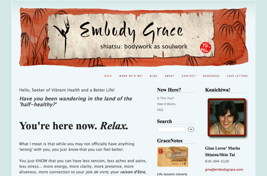
Gina first had me create a logo for her Grace in Gravity site, the brush-painted dancer in the image above. Then she asked me to turn it into a header that would work with her blog template, the vivid orange making a nice contrast to the soft, relaxing blues of the rest of the site. You can see she also used the orange in her text as the link color, drawing the header down into the site and making it all into a single unit. We actually made 3 versions of the header, one for the main site, one for her blog that says “Grace in Gravity,” and one for her newsletter, “Grace Notes.”
Many of the pieces of her header were hand-painted, including the logo and orange background, and then the design elements were layered together and weathered in Photoshop to achieve the final effect.
Maximum Monkey
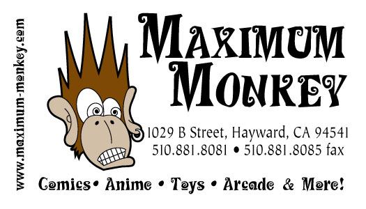
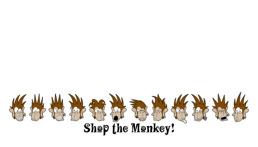
Maximum Monkey was a comic shop with a small video game arcade in the back, and they wanted something that would appeal to the geek crowd. The little monkey heads on the back doubled as a reward system for giving out coupons or freebies at the manager’s discretion.
Lambert Leadership & Literature
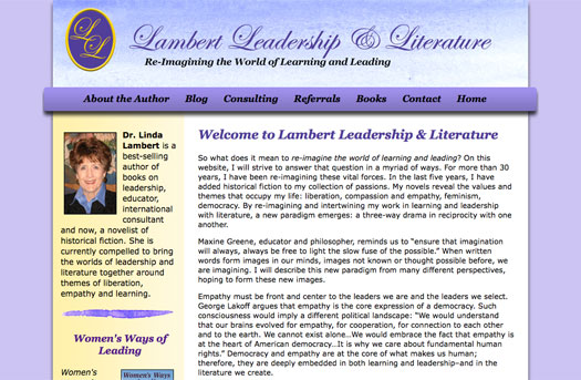
I designed the original Lambert Leadership site many years ago, and I was happy when Linda asked me to bring the site up-to-date and include a blog. We used the old logo and updated the colors, keeping a feminine touch appropriate to her lifelong career focus on women in leadership and education.
Her header features a hand-painted background, as well as the painted design elements in the design itself, giving the whole site a softer, more individual feel.
SEJ Design

Sherril Jackson originally contracted me to design her logo and business card, and we’re now also working on a website for her. Her hand-drawn logo is matched with a clean, modern typeface to bring up the image of a professional in her creative field, interior design.


